What Our Logo Stands For and Why It Matters
If you look closely at the name ConnectEd3030, you’ll notice something intentional—ED is bold.
That’s because “ED” stands for Education, but it represents much more than that. Education isn’t just about intellect—it’s about connection, empathy, and heart. It’s about ensuring that every student and educator feels seen, heard, and valued.
Four years ago, when I first stepped onto a stage to talk about empathy in education, I was filled with fear and uncertainty. Would people listen? Would they understand why this work matters? I knew that schools needed more than policies and curriculum changes—they needed real human connection.
Since then, I’ve had the privilege of leading countless workshops and keynotes, working alongside incredible educators, and learning firsthand that education is most powerful when it prioritizes both the mind and the heart. That belief is what led to the evolution of ConnectEd3030, and our logo is a direct reflection of that mission.
Why Our Logo Matters
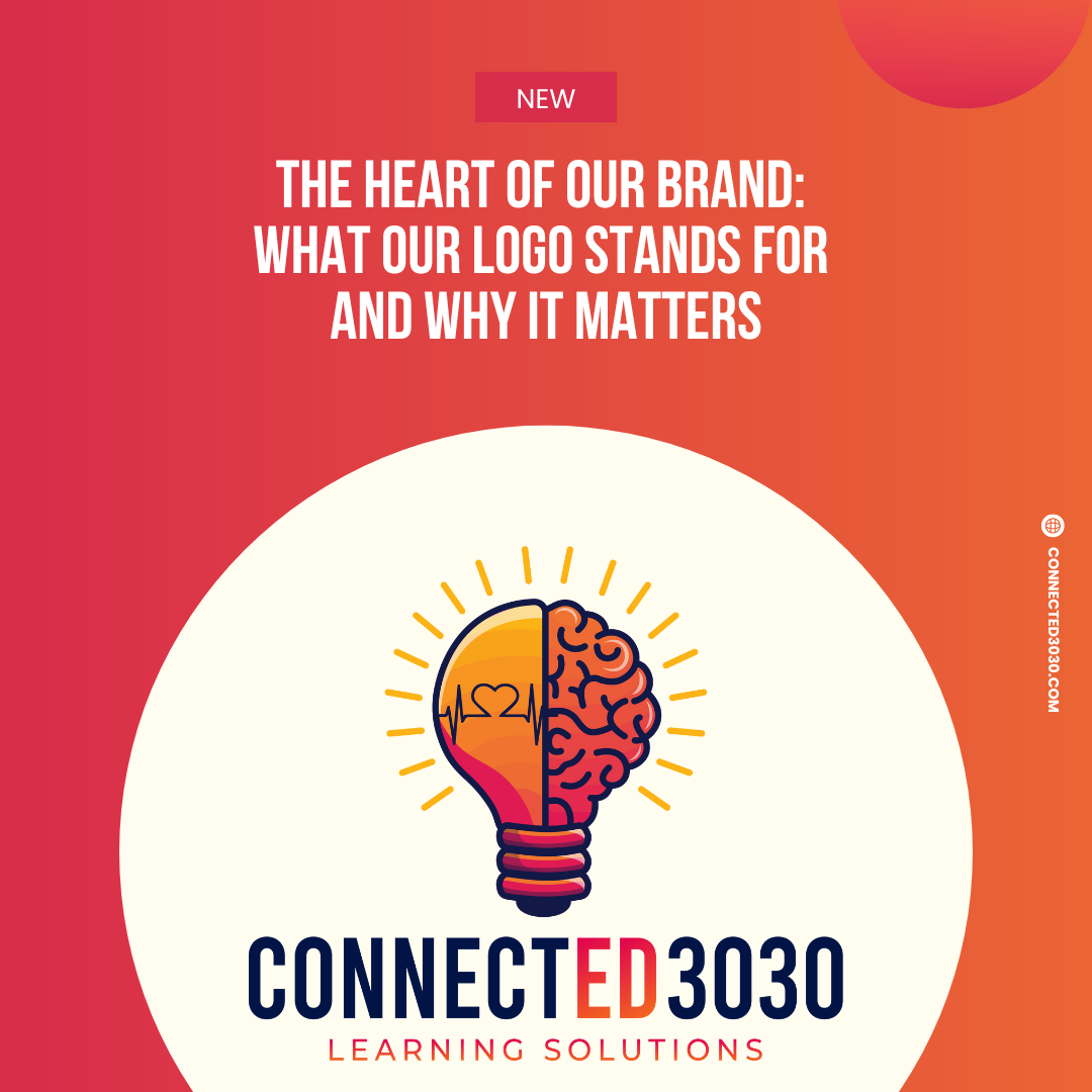
At ConnectEd3030, we don’t see our logo as just a design—it’s a statement. Every part of it reflects our commitment to helping schools build strong, connected cultures where educators and students thrive.
1. The Hidden Message in “ED”
The bold “ED” in ConnectEd3030 is more than just an abbreviation.
- It represents education that is deeply connected to emotional intelligence, empathy, and human connection.
- It’s a reminder that we are not just educators—we are changemakers, mentors, and leaders shaping the next generation with care and intention.
This work isn’t just about what happens in the classroom; it’s about how we make people feel while they’re learning.
2. The Lightbulb: A Symbol of Transformative Learning
At the center of our logo is a lightbulb, which represents the fusion of intellect (IQ) and emotional intelligence (EQ).
- A lightbulb illuminates a room, just as self-awareness, empathy, and human connection illuminate learning.
- Knowledge alone doesn’t change the world—but when combined with emotional intelligence, it sparks true transformation.
3. The Rays of Light: The Power of Connection
The rays of light surrounding the bulb symbolize what happens when we give educators and students the tools they need:
- They shine their brightest when both their emotional and intellectual needs are nurtured.
- The rays represent the ripple effect of leading with empathy—how one connected educator can change an entire school culture.
4. The Colors: Passion and Purpose
Our brand colors, Coral Red and Golden Yellow, are intentional.
- Coral Red represents passion, action, and empathy—the qualities that drive meaningful change in education.
- Golden Yellow symbolizes optimism, growth, and possibility—reflecting our belief that every student and educator can thrive when given the right support.
The Heart of Our Brand: Serving with Purpose
This rebrand isn’t just about a new name or a new look—it’s about a renewed commitment to the work we’ve been doing for years.
Every keynote, every workshop, and every conversation I’ve had with educators over the years has led to this moment. ConnectEd3030 is stronger than ever, and we are here to serve well.
To everyone who has been part of this journey—whether you’ve attended a workshop, followed along, or simply believed in this mission—thank you. Your support fuels everything we do.
And this is just the beginning.